GUIDE
Everything You Need To Prepare Your Artwork For Letterpress Printing.
Letterpress printing begins with your artwork. Every line, shape and detail in your file is translated into a custom printing plate, so taking a little care when preparing your artwork makes all the difference to the finished result.
Whether you're supplying artwork as a designer or preparing your own files, this guide will walk you through the requirements for successful letterpress printing. If you're unsure about anything, I'm always happy to review your artwork before we begin.

SET UP
Getting Your Artwork Ready
Modern letterpress printing uses precision-made polymer plates, created directly from your digital artwork. Every colour is produced from its own plate, including blind debossing and embossing, allowing even the smallest details to be reproduced with exceptional accuracy.
Beautiful letterpress comes from the combination of carefully prepared artwork, precision-made plates, press pressure and thoughtfully chosen paper. The guidelines below will help you prepare your files so your finished print looks exactly as intended.
-
Our preferred file format is an editable PDF exported from a vector-based program such as Adobe Illustrator or InDesign.
An editable PDF allows us to open your artwork in Illustrator without missing fonts or broken image links, helping ensure your files are ready for production.
For the best letterpress results:
Artwork should be created using vector paths.
All fonts should be converted to outlines.
Files should be set up in CMYK colour mode.
Supply all print colours in your artwork, and clearly indicate any blind debossing or embossing.
If you're creating multiple colours, it's helpful to organise each colour on its own layer within your artwork. As part of your order, I prepare individual files for plate making, with each colour converted to 100% black before production.
-
Raster artwork should be scanned at 600–1200 dpi at 100% size and converted to bitmap before being placed into Illustrator or InDesign. Scanning at a higher resolution helps preserve fine detail and produces cleaner printing plates. From there, save your artwork as an editable PDF using the file preparation guidelines above.
Halftones should be 100 dpi or coarser and are best suited to uncoated papers, where they produce the soft, textured character traditionally associated with letterpress printing.
-
There's no need to include crop marks, as I use my own system during production. Please make sure your artboard is set to the final trim size of your piece. If your artwork extends to the edge, include a 3 mm bleed on all sides.
-
For the best results, use a minimum line weight of 0.3 pt and a minimum font size of 6 pt. These recommendations help ensure fine details reproduce cleanly during plate making.
Please convert all fonts to outlines before supplying your artwork. If you're using delicate serif typefaces, it's worth checking fine strokes, as well as dots on i's and punctuation, to make sure they're large enough to reproduce clearly.
If you're unsure whether your artwork is suitable for letterpress, I'm always happy to take a look before production.
-
Please specify your artwork using Pantone Uncoated colours wherever possible. If Pantone colours aren't supplied, I'll match CMYK colours to the closest Pantone equivalent before production.
Letterpress inks are slightly translucent, so overlapping colours will create new colours where they meet. For example, yellow printed over blue will produce green. The colour of the paper will also influence the final printed result, as it will show through the ink slightly.
White ink is not completely opaque. When printed on dark paper it will appear softer than bright white. If you're planning to print on coloured stock and need a stronger white, we can discuss alternative options.
If you're designing with overlapping colours, using Illustrator's Transparency panel is a helpful way to preview how those colours may interact.
-
Letterpress isn't always the best choice for large solid areas of colour. If your artwork includes extensive solid areas or reversed text, I'd recommend getting in touch before preparing your files. Together we can discuss whether letterpress is the right production method or if another approach would better suit your design.
-
A deep letterpress impression is often referred to as a "bite". It's one of the characteristics that sets letterpress apart, but it does need to be considered carefully during the design process.
A heavier impression may show through on the reverse of the sheet, particularly when printing on lighter weight papers. This isn't necessarily a problem, but it's something we'll consider when selecting paper stock, planning double-sided printing and deciding how much impression is appropriate for your artwork.
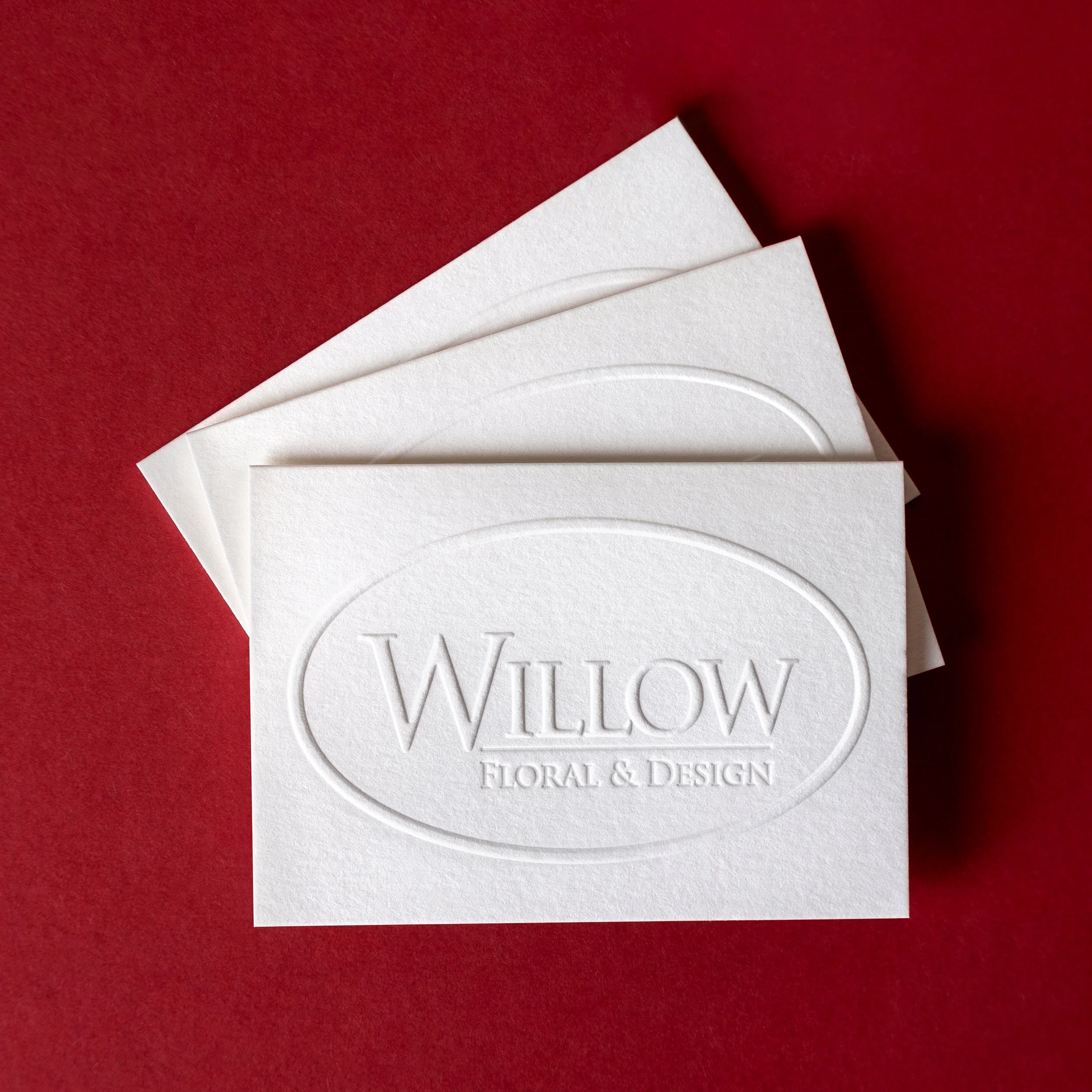
A blind impression is created without ink, using pressure alone to impress the design into the paper. It works particularly well on heavier papers and with artwork that has enough weight and scale to create a clean, defined impression.
One technique I often use is a tonal impression. By printing with a transparent grey ink rather than a traditional blind impression, it's possible to add subtle depth and definition while allowing the artwork to stand out beautifully. If you're interested in exploring this finish, I'd love to chat about whether it might suit your project.
SUPPORT
Need A Hand With Your Artwork?
If you're not completely comfortable preparing your own artwork, I can help. Whether you need a quick file check, artwork preparation or help digitising original illustrations, these services are available before your files go to print.
-
Before production begins, you'll receive a PDF proof of your final artwork to check and approve before your files go to print.
-
If your artwork isn't quite ready for production, I can prepare and optimise your files for letterpress. This is quoted individually depending on the work involved.
-
Hand lettering, illustrations and original artwork can be professionally cleaned up and prepared for letterpress printing. If you're unsure whether your artwork is suitable, get in touch and I'd be happy to take a look.
featured in